View concept details
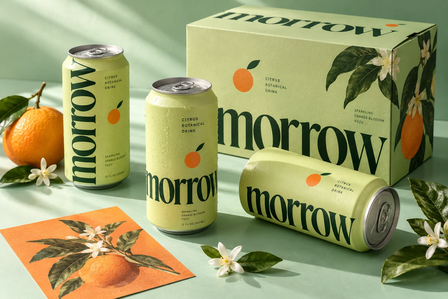
Imagine a botanical drinks range that feels as good on a kitchen counter as it does in a café fridge. The fictional brief calls for a clear, optimistic identity with enough flexibility to distinguish a growing family of flavors.
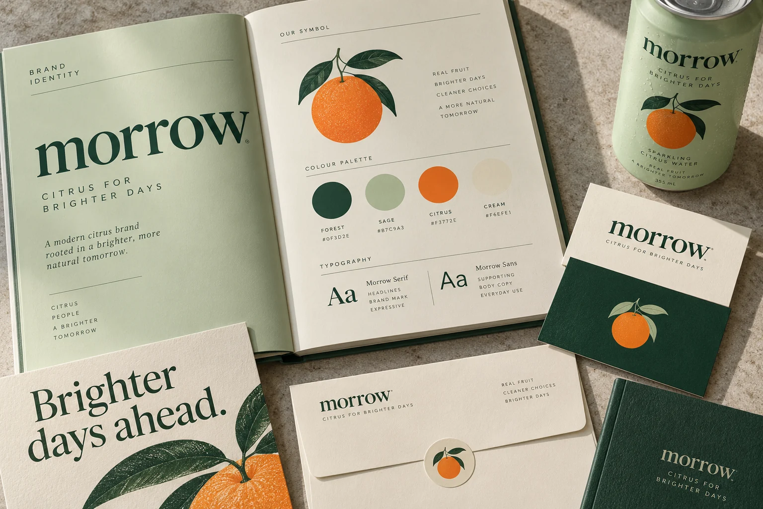
A generous lowercase wordmark brings an easy, everyday voice. Forest green provides the constant, while citrus orange and pale green create a bright product world. A simple fruit emblem connects the labels, cartons and supporting print.
Design applications
- Primary wordmark and citrus emblem
- Can labels and range architecture
- Secondary carton concept
- Brand palette and print applications